Infographic design, give tables a chance
There has been a recent backlash against infographics lately, justified as this graphic illustrates. Infographics have lost their way, their main purpose should be to make data easier to read by adding a visual perspective to the information shown. For example, using visuals can show the difference in sizes or distance better than abstract numbers.
However, the creation of infographics have been co-opted by designers and the primary goal now is aesthetics and not telling a story using data and visuals. It is time now for us math geeks to steal them back!
Original Graphic
Smashing Magazine recently published an article on infographic design which illustrates how flawed designers think when building graphics. Here are links to the articles, the original article which had so many flaws they published a follow-up article which really wasn’t much better.
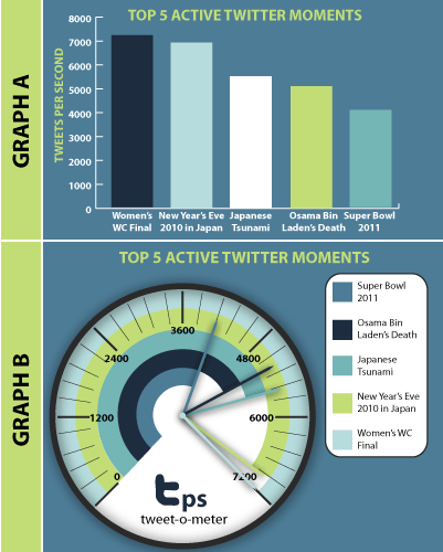
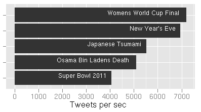
The main example used was data around the Top 5 Active Twitter Moments. This is a fairly small and simple set of data to force into a infographic; there are only five data points, of relatively non-complex data, not much need for exploration.
Compare the example displayed from the article (right) with the two simplified versions I created below. In the original graphic the labels are disconnected from the data, a poor color palette distracts from readability and superflous graphics do not add to visual comprehension.
| Event | Tweets/sec |
|---|---|
| Women’s World Cup Final | 7,196 |
| New Year’s Eve | 6,939 |
| Japanese Tsunami | 5,530 |
| Osama Bin Laden’s Death | 5,106 |
| Super Bowl 2011 | 4,064 |
Data Comparison
Here’s another example infographic where table data would get the information across much easier, Perks of Working at Google, Facebook, Twitter… This graphic makes it practically impossible to actually compare the companies and who offers what, click the link to see, the image is too large to embed.
A normal table such as this would work so much better
| Perk | ||||
|---|---|---|---|---|
| Massages | X | X | ||
| Yoga | X | X | X | |
| Foosball | X | X | X | X |
Summary
So next time you are tasked at creating a graphic, make a chart, or present data in some way; think first, can I present this information simply in a table and let people see the data. Will graphics or fancy visuals add to the story, or detract?
Can you imagine a baseball box score as an infographic, yikes!