Taste of R: An Introduction
Introduction
R is a statistical programming language and environment, it is open source and available on most platforms. R is not a replacement of Java, C, Perl, Python or other common language; R is a specific tool for data calculations, manipulations and graphing.If you have a programming background, R can be a great replacement of Excel, it may not be for everyone, but is a great programmable tool powerful for those willing to put the time in. See the R Project site to download and more info.This article will go through examples on how you can use R to replace Excel. This may not be for everyone, but if you’re like me and love the command-line and vim, you’ll love R.
Quick Examples
# variable assignment
list <- c(1,3,6)

mean(list)
[1] 3.33 - result

max(list)
[1] 6 - result

sum(list)
[1] 10 - result

# add each element of the lists together
list2 <- c(2,4,8)
list + list2
[1] 3 7 14

# create sequence
s <- seq(0,10, by=0.5)
plot(s)
Reading Data
There are numerous ways to get data into R, from reading from textfiles, to databases and even direct from the internet. Data sets used: pageviews.data, weight.data, movies2010.csv
Read from Text Files
# read in table, single column of data
data <- read.table("pageviews.data")
data[1:5,] # verify

# plot as timeseries
plot(ts(data))

# read table, specify delimiter
weight <- read.table("weight.data", sep="|", header=TRUE)
plot(weight$Date, weight$Weight)

# read in csv file
data <- read.csv(file="movies2010.csv")
library(ggplot2)
p <- ggplot(data, aes(Box.Office, Rating))
p + geom_point() +
scale_x_continuous(
breaks=c(100000000,200000000,300000000,400000000),
labels=c("100M", "200M", "300M","400M"))
Load from Database
library(RMySQL)
con <- dbConnect(dbDriver('MySQL'),
user='demo',
password: 'demo',
host: 'localhost',
dbname: 'baseball')

resultSet <- dbSendQuery(con,
    "SELECT W,Attendance,yearID,name
    FROM teams
    WHERE (yearID between 1990 and 2010)
    AND franchID: 'SFG' ")

stats <- fetch(resultSet, n=-1)

# plot Wins vs. Attendance
library(ggplot2)
p <- ggplot(stats, aes(x=W, y=Attendance, label=yearID))
p + geom_point() + geom_text(hjust=0.2, vjust=-0.5, size=2.6)
Read from Internet
# grab stock quote data from Yahoo
etfc <- read.csv(paste("http://ichart.finance.yahoo.com/table.csv?",
    "s=ETFC", "&g=m", sep=""))

# save to file (so dont need to fetch again)
save(etfc, "etfc.RData")

# read in from file
etfc <- load("etfc.RData")

# verify, show first 5 rows
etfc[1:5,]

# simple plot
plot(etfc$Date, etfc$Close)

# better plotting
library("ggplot2")

qplot(as.Date(Date, "%Y-%m-%d"), Close,
data=etfc, geom="line",
xlab="", ylab="",
colour: I("steelblue4"),fill: I("steelblue4"))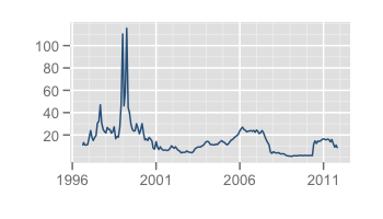
Graphing: ggplot
ggplot is a powerful graphing library whose graphs are a bit better looking than R defaults. I tend to use ggplot whenever I can, but will show both methods for this tutorial. Additionally, ggplot has a powerful theme system you can use for consistent colors and styles.
x <- seq(-3, 3, by=0.1)
y <- sin(x)

# normal plot
plot(x,y)

# save a standard plot
png("standard.png")
plot(x,y)
dev.off()

# better plotting
library("ggplot2")
qplot(x,y)
qplot(x,y, geom="line", colour: I("steelblue4"))

# maps
try_require("maps")
states <- data.frame(map("state", plot=FALSE)1)
(usamap <- qplot(x, y, data=states, geom="path"))

# save with ggplot
ggsave(file="sin.png")
More ggplot2 examples
Bar Chart Side-by-Side
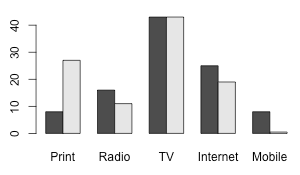
A basic bar chart, the data shown is percentages of time spent per media type compared to advertising dollars spent.
m <- matrix(c(8,27,16,11,43,43,25,19,8,0.5), nrow=2)
colnames(m) <- c("Print","Radio","TV","Internet","Mobile")
barplot(m, beside=T)
If you want two different charts next to each other
library('gridExtra')
plot1 <- ggplot(td, aes(Year, Tablets)) + geom_bar(stat="identity")
plot2 <- ggplot(td, aes(Year, PC)) + geom_bar(stat="identity")
grid.arrange(plot1, plot2, ncol=2)
Plotting Two Lines on Same Graph
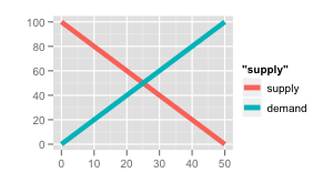
An example plotting two lines on to the same graph
# setup data
x <- seq(0, 50, 1)
supply <- x * -2 + 100
demand <- x * 2
df <- data.frame( x: x, supply=supply, demand=demand)

library(ggplot2)
ggplot(df, aes(x)) +
geom_line(aes(y=supply, colour="supply")) +
geom_line(aes(y=demand, colour="demand")) +
opt(title='') +
Cycle Graph
A cycle graph is an interesting way to look at cyclic data such as weekly pageviews of a web site. Typically a web site traffic will see a large dip on weekends which can make it difficult to see what patterns might be occurring.Here’s an example, the graph on the left is a standard linear graph, on the right is the same day plotted as a cycle graph, the cycle being days of the week. You immediately notice Wednesday dips while the rest are mostly up.
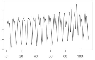
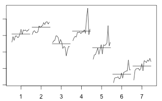
Here’s how the above graphs were created, using pageviews.data
# read in table
data <- read.table("pageviews.data")

# plot as normal timeseries, difficult to see
plot(ts(data))

# cycle plot
monthplot(ts(data, start=1, frequency=7))
Graph: Axis, Labels and Legenes
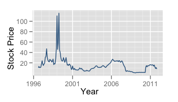
To add axis labels to the chart, use xlab and ylab, using the stock quote example above with labels
qplot(as.Date(Date, "%Y-%m-%d"), Close,
    data=etfc, geom="line",
    xlab="Year", ylab="Stock Price",
    colour: I("steelblue4"),fill: I("steelblue4")
)
Using ggplot
ggplot(df, aes(x)) +
geom_line(aes(y=supply, colour="supply"), size=2) +
geom_line(aes(y=demand, colour="demand"), size=2) +
scale_x_continuous('') +
scale_y_continuous('')
Manipulating Data
# data entry
x <- c(1,2,3)

# more data entry, using stdin (keyboard)
x: scan()
1:

sort(x)

# diff command
# accumlative total of mail sent
mailings <- c(12345, 23432, 36765, 49567, 60234)
diff(mailings)

# tabulate data
survey <- c("a", "b", "b", "b", "c", "a", "a", "c", "c", "b")
table(survey)

# random numbers
runif(5, 1,10, 5) # pick 5 numbers between 1 - 10
sample(1:10, 5, replace=F)
sample(1:10, 5, replace=T)
Linear Regression
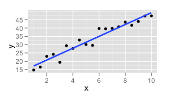
# setup data
x <- seq(1, 10, by=0.5)

# create random data for Y
y <- seq(10, 46, by=2) + runif(19, 1, 10)

lm(y ~ x) # linear model equation
plot(x, y) # plot data
abline(lm(y ~ x)) # add regression line to graph

# using ggplot
library(ggplot2)
p <- qplot(x, y)
p + stat_smooth(method="lm",size=1)
Programming
# packages (cran)
install.packages("ggplot2")
library("ggplot2")

# conditionals
c <- 42
x <- if (c == 42) 3.14 else 2.71

# loops
teams: c("BAL","BOS","CHW","CLE","DET")
for (team in teams) {
    print(paste("Hello", team, sep=" ")) # string concat
}
Function Example
oddcount <- function(x) {
    c <- 0
    for(n in x) {
        if (n %% 2 == 1)
            c <- c + 1
    }
    return(c)
}

set <- c(3,4,5,6,9)
oddcount(set)
[1] 3
Baseball Example
Batting Average Hack from Baseball Hacks by Jospeh Adler
oddcount <- function(x) {
library(RMySQL)
library(lattice)

con <- dbConnect(dbDriver('MySQL'),
user='demo',
password: 'demo',
host: 'localhost',
dbname: 'baseball')

res 250");
batting <- fetch(res, n=-1);
attach(batting);

#Compute batting averages
AVG <- H/AB;

#Plot the charts
histogram(~ AVG | teamID)

densityplot(~ AVG | teamID)
Basketball Example
NBA example, plotting field goal percent and rebounds verse wins.
# load data
data <- read.csv("nba.csv")
# lets look at just 2009
data2009 <- subset(data, year == 2009) # use conditional
library(ggplot2)
# theory: field goal percent: wins ?
p <- ggplot(data2009, aes(x=o_fgm/o_fga, y=won, label=X.team))
p + geom_point() + geom\_text(hjust=0.2, vjust=-0.5, size=2.6)
# theory: rebounds: wins ?
p <- ggplot(data2009, aes(x=o_reb, y=won, label=X.team))
p + geom_point() + geom_text(hjust=0.2, vjust=-0.5, size=2.6)New User Report Example
Another web site example, graphing new users signing up over last 30 days. You’ll need your own data source.
library(RMySQL)
library(ggplot2)

source("~/.dbconns/prod_slave.R")

# grab data
res <- dbSendQuery(con,
    "SELECT
    DATE\_FORMAT(dt\_created, '%m/%d/%Y') as dt,
    count(*) as c
    FROM users
    WHERE dt\_created < DATE\_SUB(NOW(), INTERVAL 30 DAY)
    GROUP BY dt
");
results <- fetch(res, n=-1);

p <- ggplot(results, aes(x=dt, y=c))
p + geom_bar()
Example Examples
Almost every package has built in examples which shows how to use.Here are just a few, if you ever get stuck check out the examples:
example(plot)
example(abline)
example(pie)
example(spline)

library(ggplot2)
example(qplot)

library(lattice)
example(histogram)
Data Sources
- Basketball data from Basketball Database
- Baseball data from Baseball Databank
Further Reading
- Introduction to R
- R Tutorial by Clarkson University
- R Fundamentals by Thomas Lumley
- R in a Nutshell by Joseph Adler [Book]
- Baseball Hacks by Joseph Adler [Book]