World Revolutions data visualization
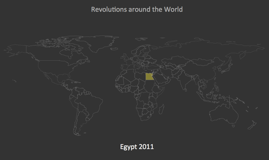
The recent events in Tunisia and Egypt got me thinking about revolutions across history. They tend to cluster together both in geography and time. So being on the current data visualization kick I’m on, it sounded like a fun little project. The following is a world map highlighting revolutions going forward in time.
The data was collected from Wikipedia, in particular their List of Revolutions. Unfortunately, the list is quite long and contains a list of minor revolts, failed coups and other less notable events. Once again proving that data gathering is the hardest part of any data visualization project. I’m not a historian, so forgive me if I left any off or made any mistakes.
Once I gathered up the data, I tried out a couple of JavaScript libraries to map them. Initially I attempted using the Google Geomap Visualization, I was able to get the mapping down, but had trouble with animating it as a timeline.
I ended up working with a World Map created by John Emerson using Raphael JS. The mapping was already there and working with animating the data was fairly straightforward.
Enjoy.